contact us

Curious to learn more about custom/retail fonts or font services?
Send me a note and I'll get back to you typically within 24 hours.

Email: neil@greyletter.com


Portland, Maine

207 200 3470

Neil Patel is the designer behind Tetradtype, an independent digital type foundry that crafts custom and retail fonts for creatives. Before founding Tetradtype in 2009, Neil spent a decade working as a semiconductor process engineer specializing in sub-micron printing—an experience that compels him to balance the aesthetic with the technical. 

design

An assortment of Greyletter's Work


Filtering by Category: Enhancements

Blue Smoke OpenType Enhancement

Neil Patel

Brief

Blue Smoke, a BBQ restaurant in NYC, was working with their designer to develop a new menu format.  To identify whether certain menu items were gluten free, nut free or vegetarian, their designer, Eric Baker, created a set of icons to be inserted next to those menu items. I was initially requested to simply add the icons to their font so they could be inserted via the glyphs palette. After some discussion I realized it was the restaurant staff that was going to update the menus on a semi-regular basis using Microsoft Word. It would be a time consuming process for them to insert and precisely place the extra text boxes in Word. To make things simpler I suggested that we used an OpenType feature, which could be enabled in the template styles, to automatically substitute in the correct icon if the letters "GF" "NF" or "V" were typed into the menu.


Design

Adding the icons to the font was relatively straightforward, and then the OpenType feature was coded to allow the user to easily sub in either of the two versions of the icons, using stylistic sets.

BlueSmoke3.png

Error Proofing

With the substitution feature turned on, it would have been possible for the icons to show up in unwanted locations—every time the letters "GF," "NF," and "V" appeared. The example below shows a few words that would cause the icons to show up in these unwanted places. 

Illustration of the how intelligent substitution prevents errors

Illustration of the how intelligent substitution prevents errors

To account for this I modified the substitution program to prevent substitution of the icons if letters were present on either side of the key input characters. The project could have been wrapped up with the simple substitution but the goal was to have the OpenType feature be easy to use; it should work without errors, even for non-designers. 

L.L.Bean OpenType Fractions

Neil Patel

OTCustomization.png

Brief

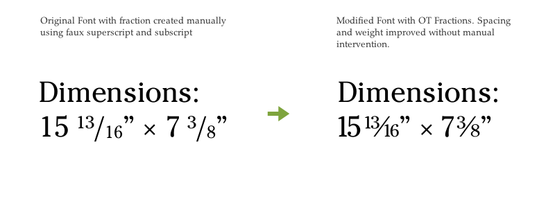
Producing an array of product catalogs every quarter is a labor-intensive task that involves managing and coordinating a lot of copy and images. Spending man hours on repetitive tasks is not only inefficient but opens up the window for errors. This is just the issue that L.L.Bean was dealing with. Their catalogs are filled with dimensional information for a variety of products.Their style guide required use of fractions for describing details of product sizes and shapes. The fonts being used however, did not come with a fractions feature. The workaround was a macro that placed all the figures, sized them and shifted them into the numerator or denominator position. The drawbacks to this approach are that a fraction made this way is visually lighter and proportionally narrower than the rest of the type (because it uses scaled versions of the full-size numbers) and it requires a repetitive, error-prone manual process.

Solution

To remedy this situation, L.L.Bean asked me to implement an OpenType Arbitrary Fraction feature into their fonts. This included extending the character set to include missing numerator and denominator figures and writing the necessary code to substitute them when they occur in the presence of a slash (/). I wrote the feature such that it can be enabled all the time to simplify the implementation.

OT fraction implemented in catalog

OT fraction implemented in catalog